
YOPX Brand Identity
Following the successful collaboration with Parkinson’s Australia, YOPX (Young Onset Parkinson’s Exchange) approached Toolbox to develop a brand identity that would work consistently in collaboration with the current Parkinson’s Australia brand landscape.
YOPX is here to empower younger individuals with Parkinson’s, along with their carers, friends, and family. The app is designed to foster a supportive community, offering a platform to share meaningful experiences and helpful resources.
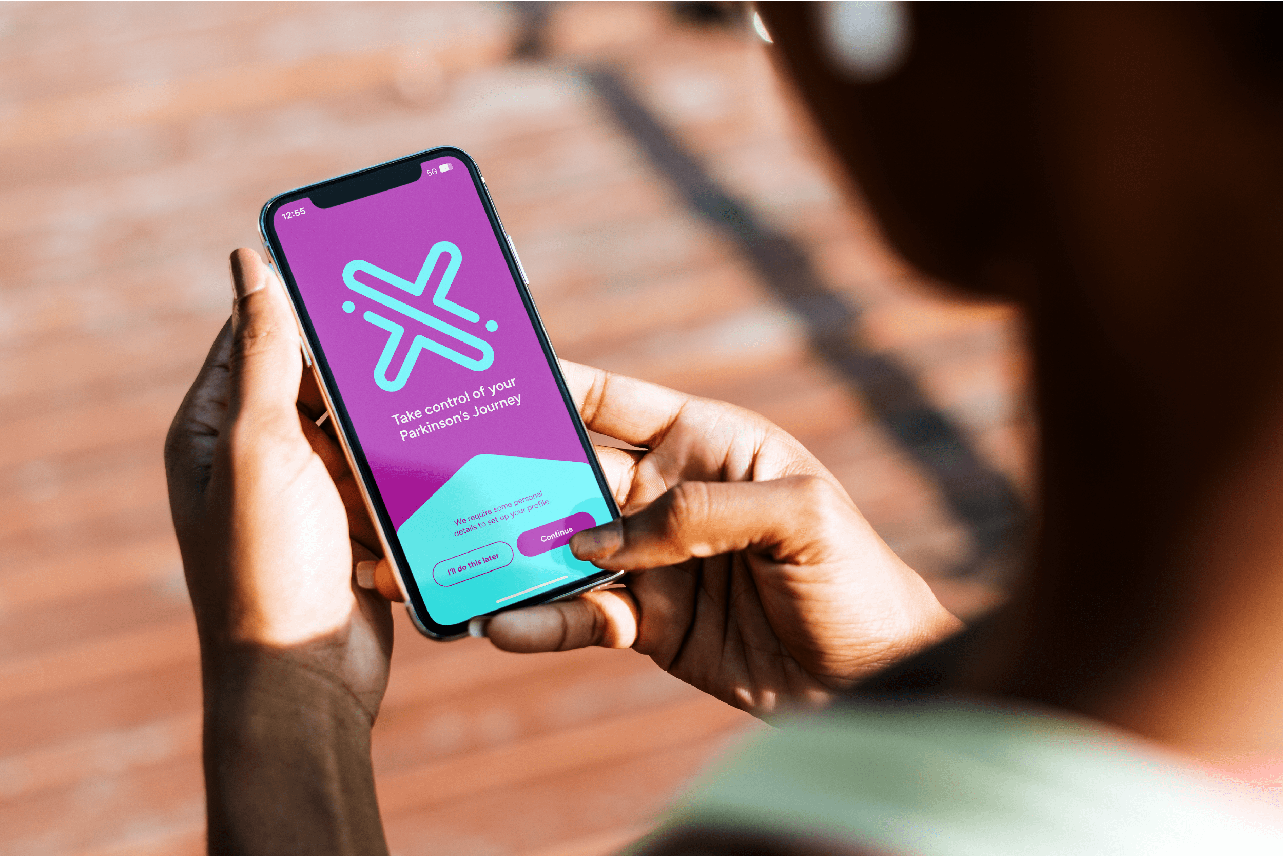
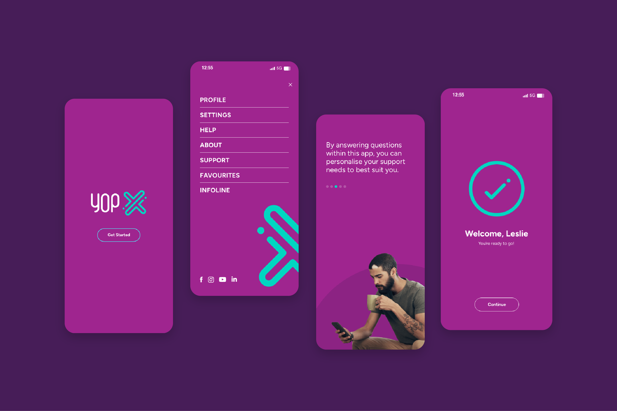
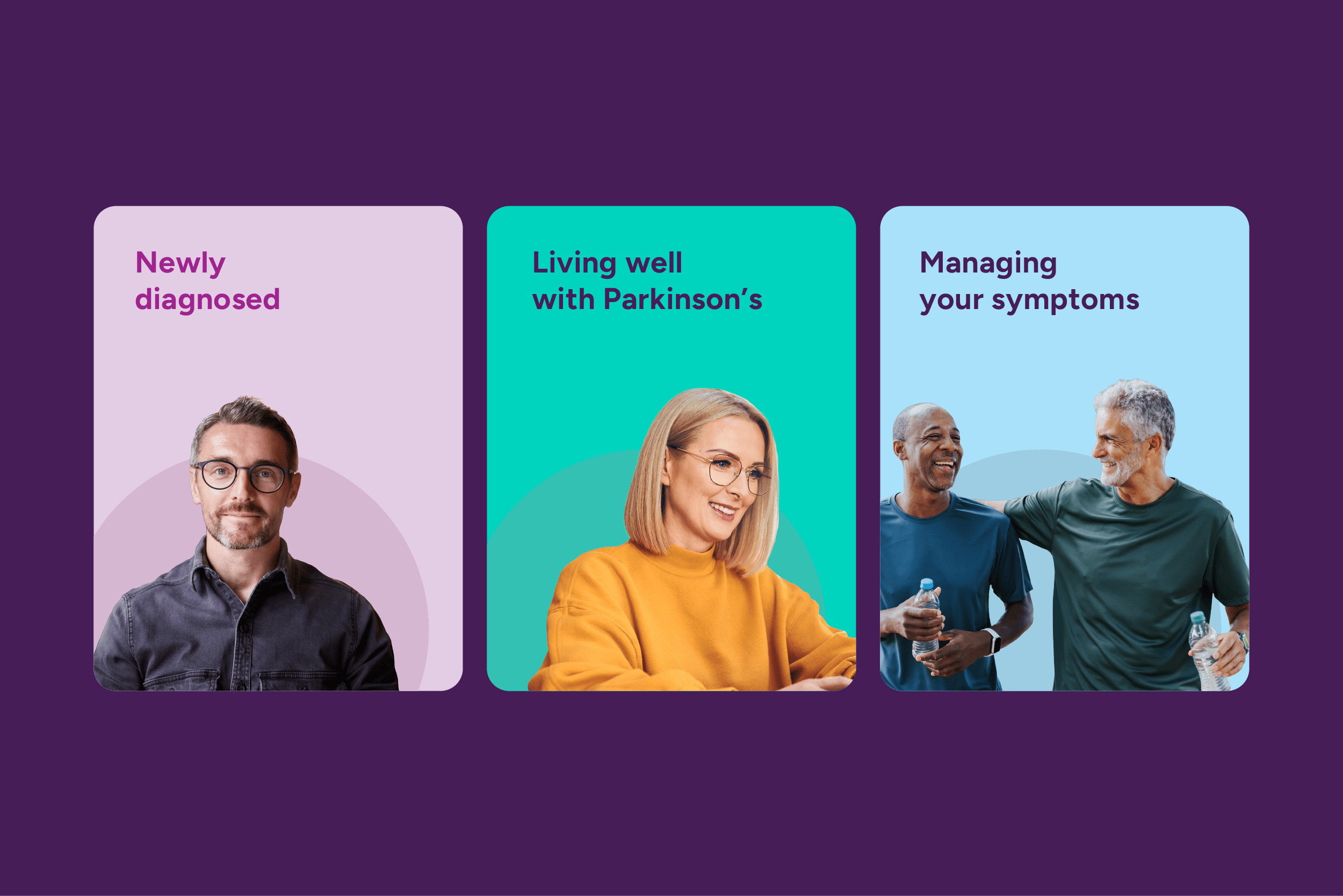
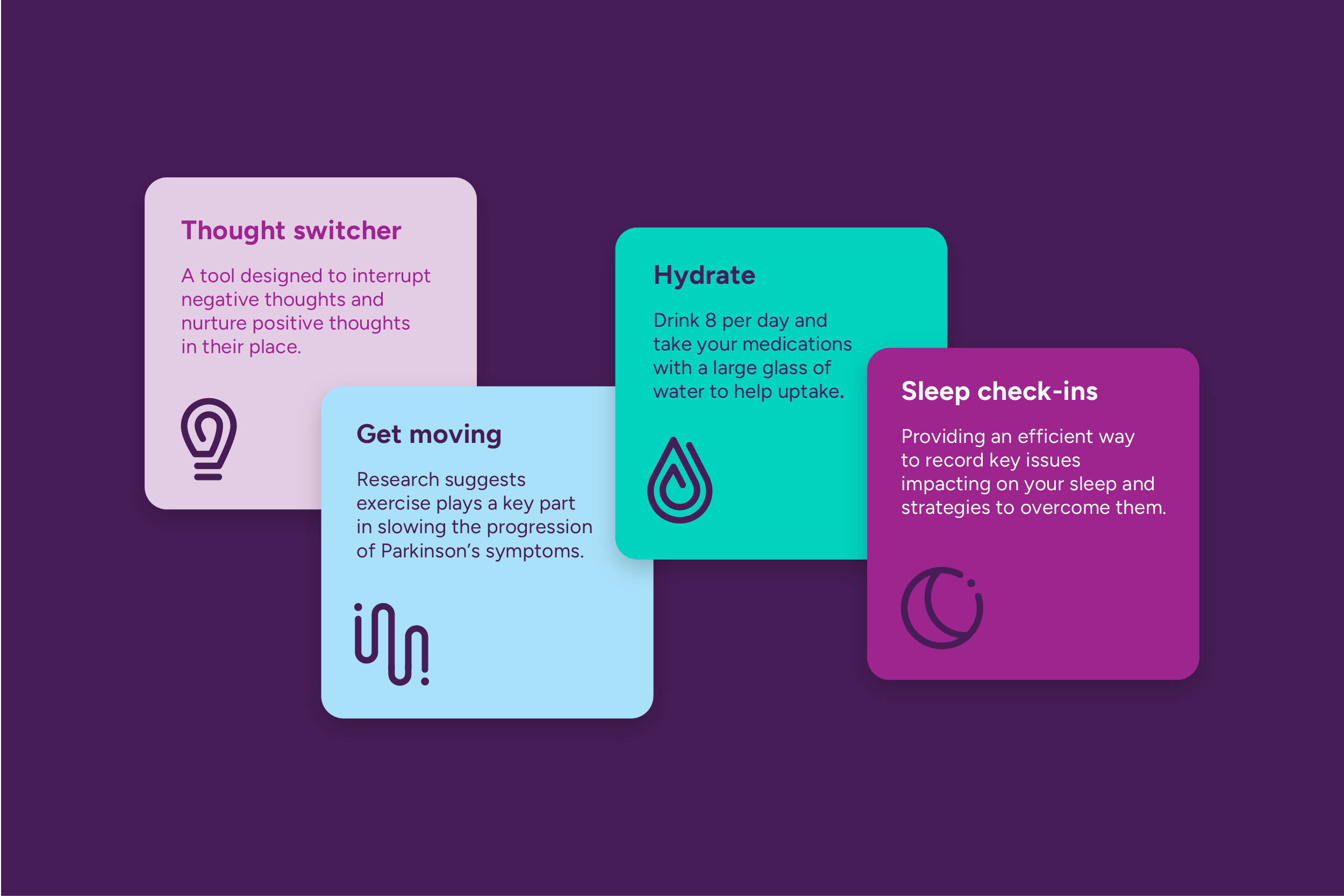
Toolbox designed a brand identity which extended across a mobile app and website with up-to-date information on how to live well and manage Parkinson’s disease. Developed as a living lab model, the experiences, ideas, knowledge, and daily needs of people with YOP have underpinned the app and website content. More than one hundred individual stories and experiences shape their tips, tools, and resources. With this in mind, it was essential that Toolbox capture the true breadth and diversity of the stakeholders involved with YOPX, while still creating dynamic, vibrant and accessible design solutions to support their needs.
The dynamic ‘X’ represents an exchange of connection and support, while complementing the Parkinson’s Australia brand identity we designed earlier this year. While the deep purple and bright cyan colours symbolise the hope and forward-thinking that YOPX stands for. Collaborating with the Parkinson’s Australia team on two significant brand identities has been a rewarding experience for our team, and we are so grateful to have made a meaningful impact on an important cause through our design work.
