

THE CHALLENGE
As one of the first and only suburbs in Australia to receive the National Broadband Network with Fibre-to-the-Home, the City of Prospect has a competitive advantage in the technology and connectivity of its homes and businesses. The aim of this project was to create a name, identity and vibrant brand rollout for an economic development focussed program to bring people, business and investment to the City.
The brand needed to engage, inform and inspire people to take a fresh look at City of Prospect and understand the aims of the project quickly, and clearly. Whilst doing this, the new identity had to sit comfortably alongside the existing City of Prospect brand, as a sister brand, but not confused with it.
THE SOLUTION
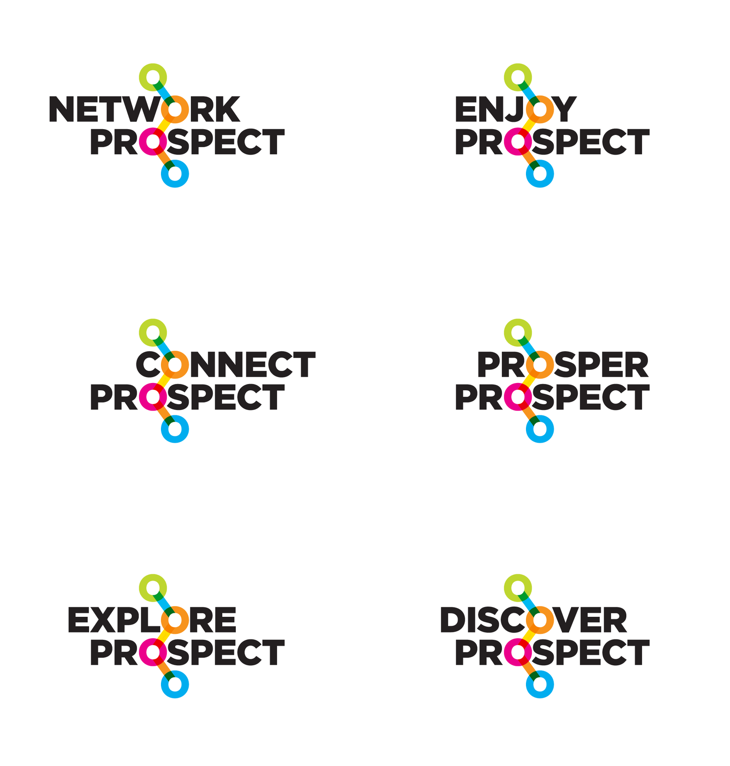
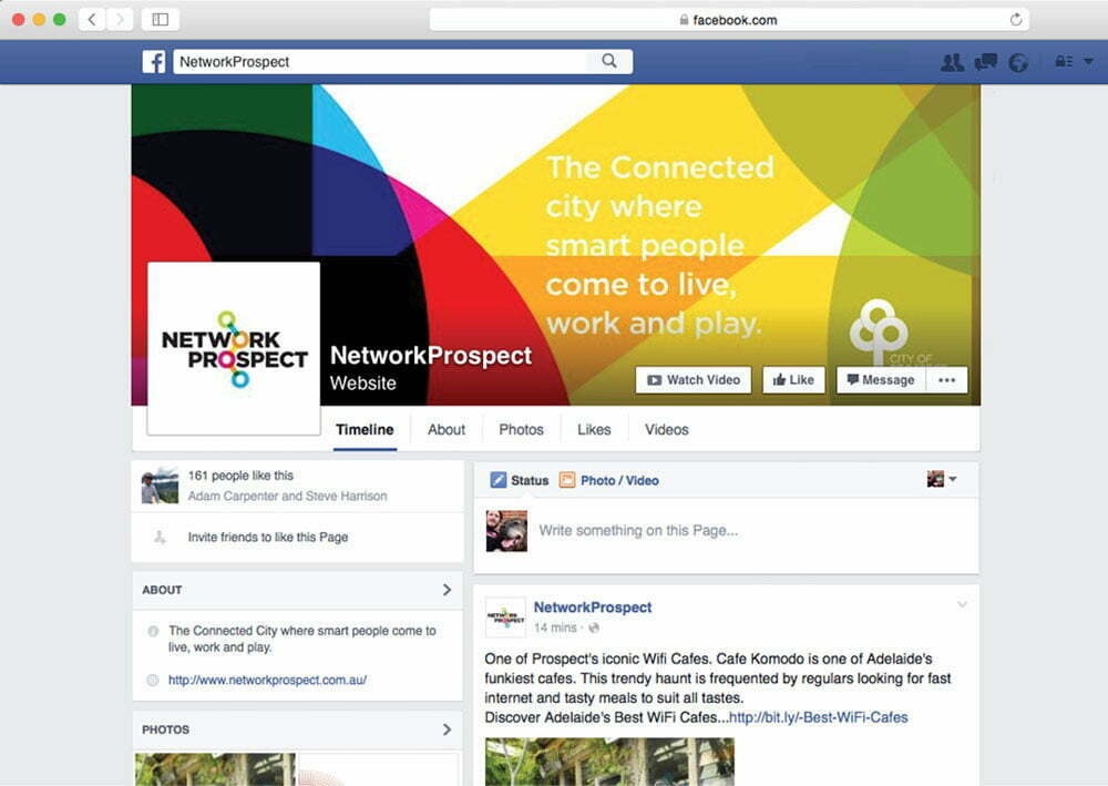
Toolbox explored hundreds of different naming conventions, the issue was, with so many functions for the campaign to perform, one name alone would never cover the full breadth. For this reason we settled on a fluid brand, held together by a linking device which connects the letter O’s as linked nodes, where the name could change through a suite of words, with the over-arching title being Network Prospect.
This fluid brand with is changing animated logo personifies the technology being embraced and the breadth of the project, whilst allowing the technology to showcase these words in an endless loop sequence on website, videos and presentations.
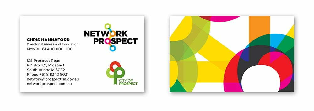
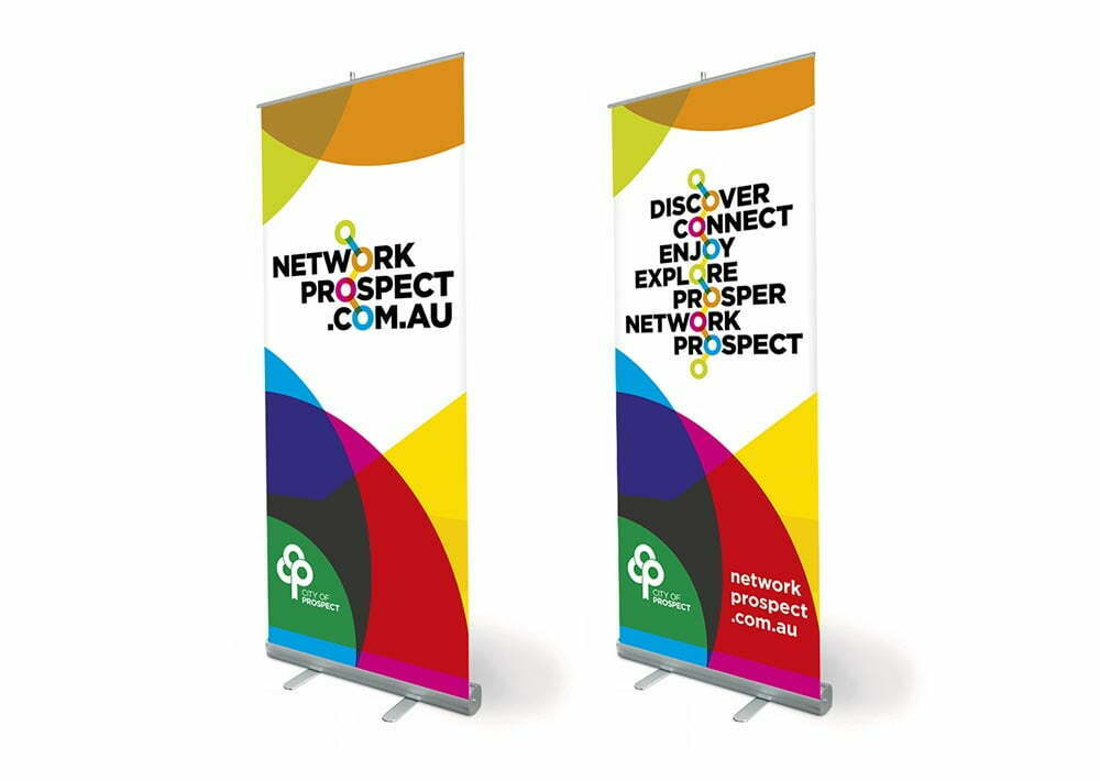
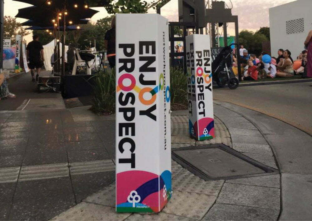
The printed applications of the brand showcase different word combinations for different applications, or even allowing for all to be connected with the linking device in the brand.
